


Let’s first look at: What does “poor” mean?
It is not just about money. But what should be included?
I like the Multidimensional Poverty Index (MPI) published by the Oxford Poverty & Human Development Initiative (OPHI) and the Human Development Report Office of the United Nations Development Programme (UNDP).
The MPI measures how people experience poverty in key areas of well-being across more than 100 countries. This data focuses on low- and middle-income countries, where acute poverty is more severe and widespread, so it does not include richer countries.
Our World in Data has a great article, explaining the index.
So, what is included?
, which measures poverty using three main dimensions: Health, Education, and Standard of Living. Each dimension has specific indicators:
1. Health - represented by two indicators: “Nutrition” and “Child Mortality.”
2. Education - represented by two indicators: “Years of Schooling” and “School Attendance.”
3. Standard of Living - represented by six indicators: “Cooking Fuel,” “Sanitation,” “Drinking Water,” “Electricity,” “Housing,” and “Assets.”
Each dimension and its indicators are organized in a stacked block format, with Health at the top, Education in the middle, and Standard of Living at the bottom.")
The MPI is made up of ten indicators grouped into three dimensions: health, education, and living standards.
Similar to traditional measures of monetary poverty, the calculation of the MPI involves setting poverty thresholds and then counting the number of households that fall below these thresholds.
You can see details on the specific thresholds for each indicator in the table below.
, which measures poverty using three main dimensions: Health, Education, and Standard of Living. Each dimension has specific indicators:
1. Health - represented by two indicators: “Nutrition” and “Child Mortality.”
2. Education - represented by two indicators: “Years of Schooling” and “School Attendance.”
3. Standard of Living - represented by six indicators: “Cooking Fuel,” “Sanitation,” “Drinking Water,” “Electricity,” “Housing,” and “Assets.”
Each dimension and its indicators are organized in a stacked block format, with Health at the top, Education in the middle, and Standard of Living at the bottom.")
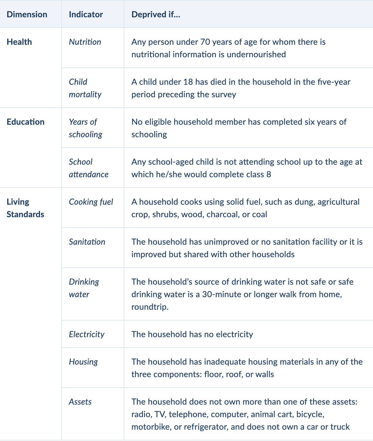
Reading those thresholds stunned me. They are specific. Easy to imagine.
In the graphic below, you see the share of people living in multidimensional poverty in the specific country.
Included is data from 112 countries covering 6.3 billion people = roughly 80% of the global population.
Here you can see it in more detail yourself.
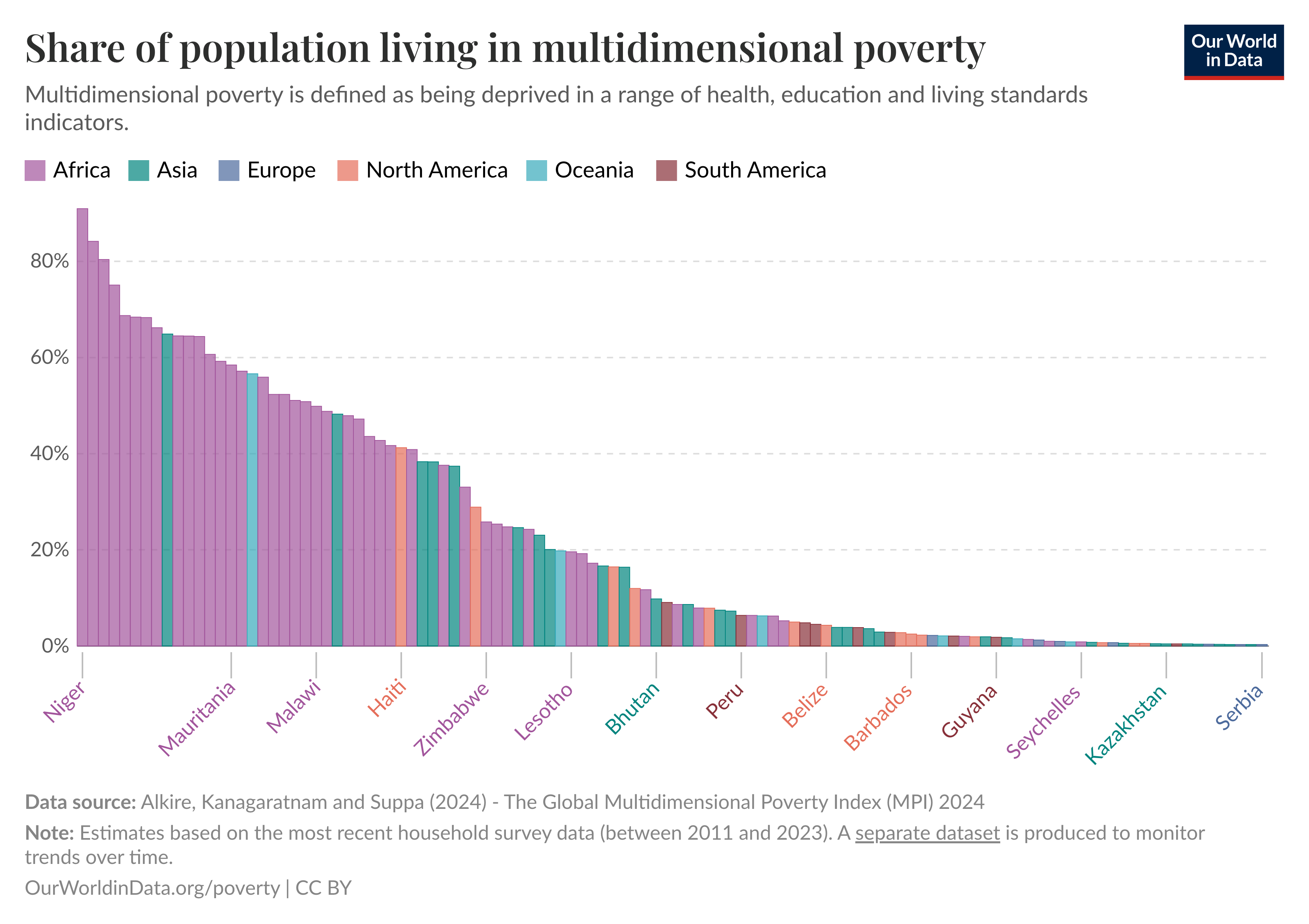
According to the report, 18.3% of the 6.3 billion in the 112 countries covered are multidimensionally poor.
= 1.15 billion people.
So this is an example of what “poor” could mean.
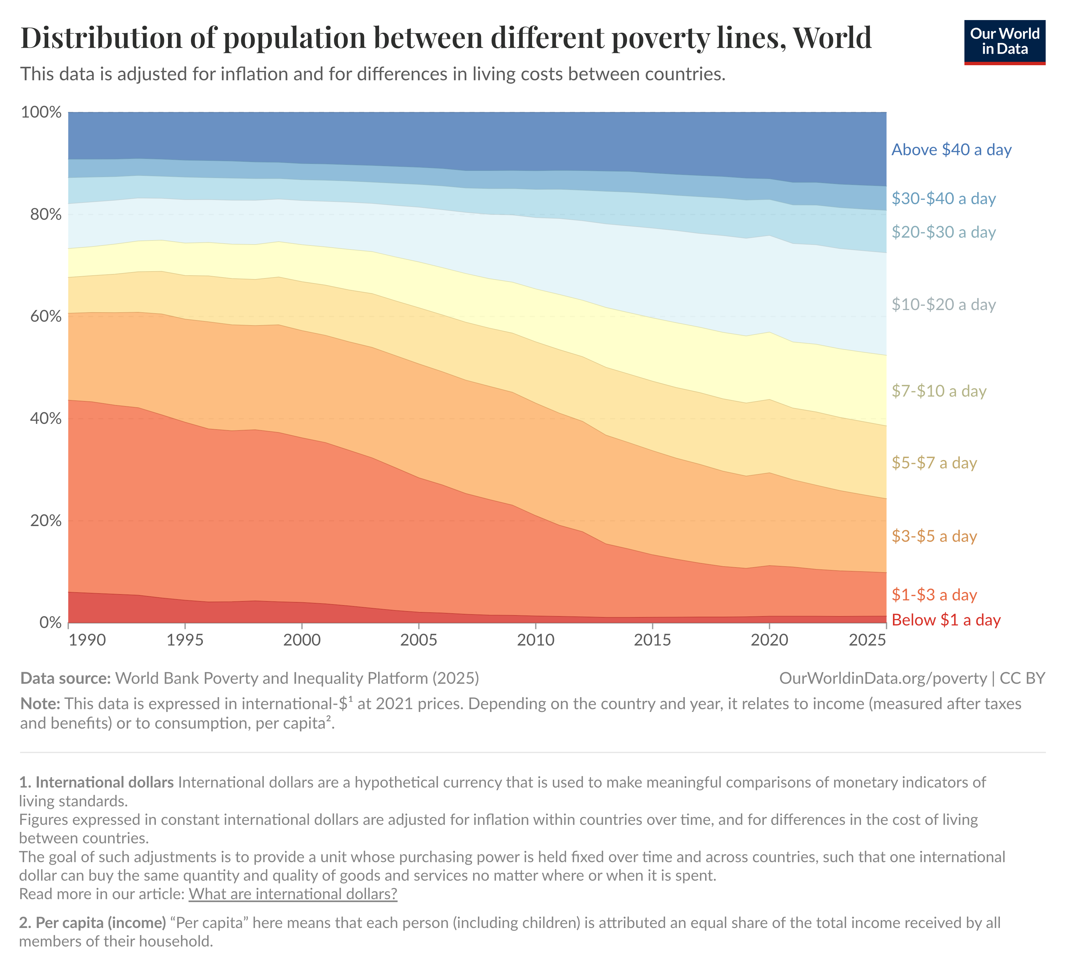
Looking at money: The International Dollar
So money is not the only aspect of being poor or rich, but it is still important, and there is good data on it.
Before looking at this, I want to introduce the concept of the “International Dollar”
An international dollar is a made-up currency that helps compare money across different countries. It shows how much something would cost if prices everywhere worked like they do in the U.S. Instead of just using exchange rates, it adjusts for local prices (purchasing power). That way, you can see what people in different countries can actually buy with their money, not just how much their currency is worth on paper.
What does this help with?
Critique:
“Well, people in country X only earn $5,000 a year, but things are way cheaper there, so it’s not really that bad!”PPP answer:
“True, and that’s exactly why we use purchasing power parity (PPP). Instead of just converting with exchange rates, PPP adjusts for local prices. So $5,000 in country X might have the same buying power as, say, $12,000 in the U.S. That way we can compare living standards more fairly.”A well-known example is the “Big Mac Index”

Find further explanation here.

Looking at money: Feeling “poor” and “rich” at the same time.
While in Germany as a medical student, I felt “rather poor”. While doing an internship in Sri Lanka, I felt “rich”.
Often when I am on a train ride, I try to guess how many of the people in my wagon have more money than I do, and how many have less.
In Sri Lanka, my guess was: very likely I have more.
In Germany (as a student) - very likely I have less.
This is not a surprise. When looking at the income distribution of two different countries (now taking Burundi and the US, all in international dollars), it becomes clear.
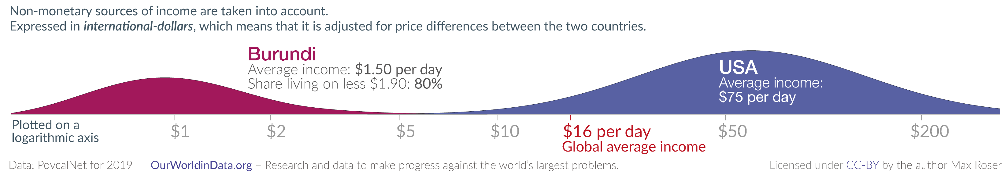
Let’s say I had 25 EUR a day in Germany, that’s roughly 35 international Dollars. (0,7 EUR = 1 international dollar. World Bank Calculator). This would have put me way on top of the “income distribution” in Burundi (richest 1%), but in the US, still in the lower third (let’s say the lowest 30%).
Looking at money: “Poor” ≠ “Poor”
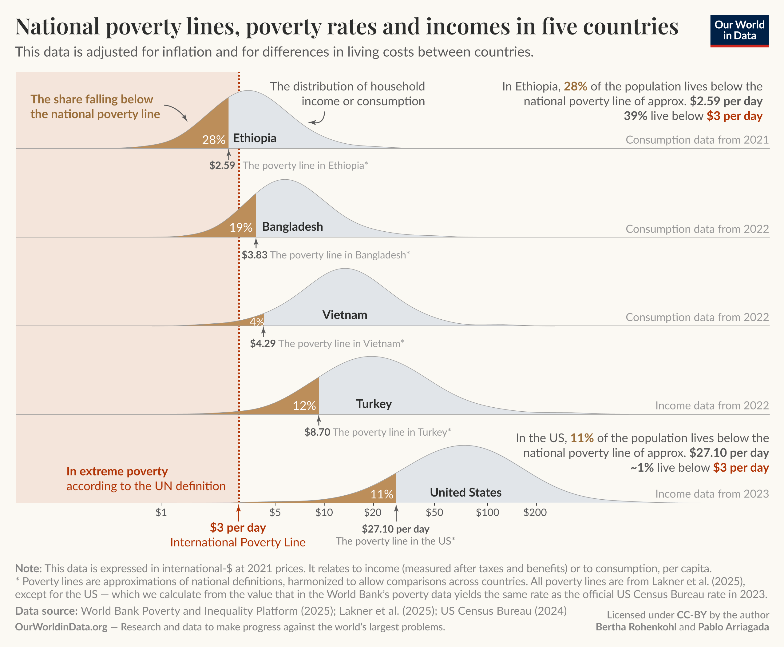
There is no single definition of poverty. Our understanding of the extent of poverty and how it is changing depends on which definition we have in mind.
In particular, richer and poorer countries set very different poverty lines in order to measure poverty in a way that is informative and relevant to the level of incomes of their citizens.
While a person in the United States is counted as being in poverty if they live on less than int.$27.10 per day, in Ethiopia, the poverty line is set more than ten times lower — at int.$2.59 per day.
How rich am I?
Okay, that’s what “poor” looks like. What does “rich” look like?
Again, there is no single clear definition. But looking at income, the following two and a half graphs are stunning and somewhat enough for me to answer the question.
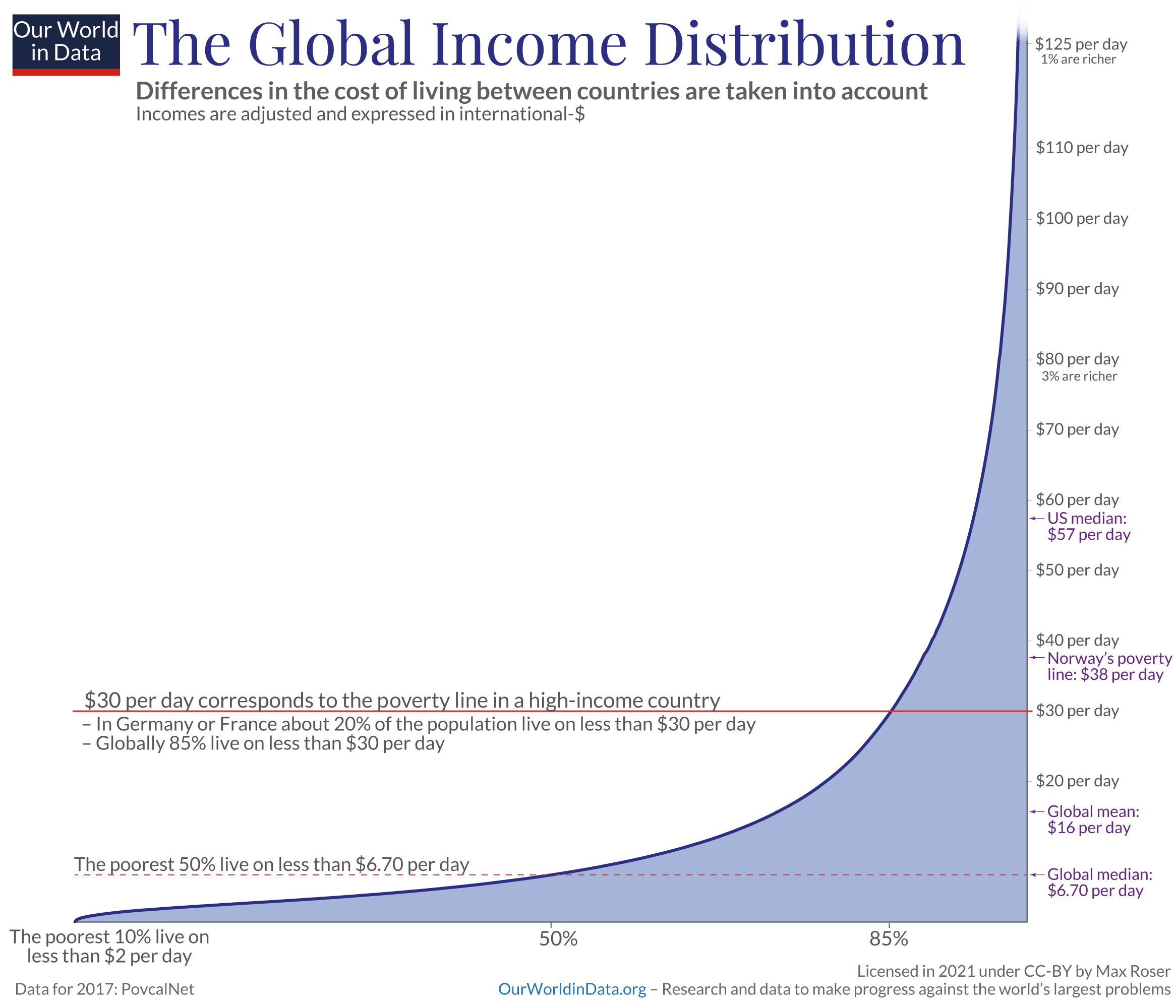
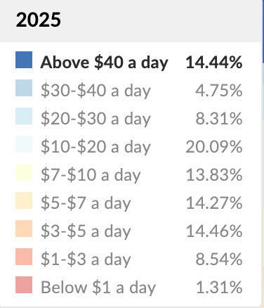
Just 14.44% of the global population has more than int. $40 per day.
= 56 EUR per day
= 40 CHF per day.
= 58 GPB per day.
As a medical doctor working at an NGO in Switzerland, I earn around 4500 CHF per month. 1 CHF is nearly exactly 1 int$.
int.$ 4500 / 30 days = int.$ 150 per day.
Looking at income, this puts me into the richest 1% globally.
How rich am I?
Absurdly rich!
I decided to write in a more bullet-point style, as it usually takes me about an hour to draft my posts, putting down my main thoughts, and then another 5+ hours to polish them (= back and forth with GPT correcting spelling and grammar mistakes and trying to make it clearer what I actually wanted to say, just to see that what GPT offers is 80% good, but 20% are exactly not what I meant by this, etc…).
I remembered that Amboss, the main learning platform I used while studying medicine, was also writing all their articles mostly in a bullet-point style, and I actually liked it a lot!
I hope that “others and myself” get 80% of the value in 20% of the time. 😉